User:Robert
I support the license
upgrade to ODbL v 1.0
Social OSM mockups
Around autumn 2011 I was throwing some ideas around thinking about what a more "socially oriented" openstreetmap would look like. I may well have cornered you in person and ranted at you about it for a while. Anyway, here are the mockups I did around the idea.
Around this time I'd been doing a little straw poll among new users and beyond the various troubles they were having the one thing most people felt was that openstreetmap was "vast and impersonal" (as one user put it so well). Which is fully understandable.
The far-fetched
While OSM (at time of writing) does have various "help" initiatives - http://help.openstreetmap.org (the "Q&A" site), IRC, slightly more formal documentation on the wiki - these are all more or less hidden behind the label "Help". But unfortunately this isn't really how people ask for help in real life. If you're at, for instance, a public workstation trying to do something and needing help, you don't typically stand up, raise your hand and loudly exclaim "Help!". You probably lean across to your neighbour and quietly ask "Um, excuse me, how am I supposed to...?". The latter is far more natural, less daunting, less formal and opens up far more social possibilities than just simple "help".
New users want to have their hands held just as much as they want hard answers.
Of course, the most literal way of adapting this analogy would be to have the "person at the next workstation" be other users who've been editing in the same area and using the editor to indicate their local presence spatially. As in Fig 1a, which is supposed to be a diagram of a Potlatch-like editor with local (or locally editing) users shown as being just off screen. Now, there are a lot of implementation issues here, the most glaring of which is coming up with an algorithm for determining pseudo-ownership of an area. I imagine such a scheme would define any one point in space as belonging to one and only one user at any particular time dependent mostly upon recentness of editing and total amount of editing in an area. My mind sees something with centroids and weighted voronoi cells.
Note this is not the same thing as a user's "home location", not just because of its dynamic nature but because a user must be able to have a presence in more than one place. I for instance have done large amounts of editing in areas of various cities around the UK, Port-au-Prince, parts of San Francisco, Tehran... perhaps this is a bit unusual, but I expect the typical productive mapper at least has an editing presence in more than one city in their country - more than can be expressed with just a home location.
Local-ness of help brings a few advantages "for free":
- (usually) solves language-barrier-type issues between users
- users are more likely to be able to help with country-specific issues (tagging of various odd road rules etc)
- you're likely to get in touch with a person who has actually previously edited (or even just been to) the features you're looking at. (Which also can help resolve issues and reduce puzzlement amongst users with, um, esoteric mapping styles)
Of course, not all users are willing or appropriate to provide help to other users. Users' prominence in these views would need to be weighted by:
- Experience (how this is determined is another big question mark)
- Willingness to help (could easily be exposed as a user preference)
- Recentness of activity (anywhere on the planet)
A slightly easier option to working out precise cells of pseudo-ownership could use a more approximate spatial predicate to choose relevant other users to show in a more traditional roster style (Fig 1b and its collapsed view Fig 1c). Perhaps something as simple as "users who've edited objects in this bounding box", expanding the bounding box until a sufficient number of other potentially useful users are shown.
Or if it's thought there's too much information on the editing screen itself, other users presence could be shown in a separate zoomed out view displaying the editing area in a wider context (Fig 2).
But you don't need me to tell you that these ideas are slightly fanciful and development would be difficult & high impact. Which isn't how things tend to be developed in OSM. Incremental improvement tends to be far more successful and popular. So with that in mind:
Lower hanging fruit
There are still a good few things that can be done within the current framework of our "help" systems as we have them to improve user experience.
Q&A system
Namely integration and geo-enabling of.
It wouldn't be too hard[1] to add a few new fields to each Q&A question. I would propose adding a "location" field (shown on-page as a small slippy map) and a "screenshot" to questions. A user screaming "help" in the editor could simply start the process of creating a new question with the location & screenshot pre-added (I suppose either of them could be optional). The screenshot's there to help resolve UI & tool issues and the slippy map is intended for more geographical issues. An interesting side note here - it's "trivial" to take a screenshot in Flash, but there's no good way to do so in HTML5. So I grudgingly accept that flash wins here.
[1] I say this however I have looked at the OSQA code with the intention of staking this work out and it's somewhat of a brainfuck. Not helped by the fact it seems to be abandonware.
From the helper's perspective, the Q&A site has a pretty useful tag filtering system which could be extended to allow helpers to browse areas of interest to them (i.e. filterable by location?).
Now, there remains the problem of Q&A lacking instant replies & conversation. Which brings me to
IRC
OSM is lucky in having a very active & useful IRC community. But IRC is scary. Especially for non-techies. And launching an IRC client, finding the right channel and explaining your problem in text is not a seamless experience. But it would be silly to not take advantage of our existing IRC community.
Both HTML5 and Flash IRC clients exist, so I considered the possibility of integrating an IRC client right into the editor (Fig 4b or possibly c). Again, adding a screenshot and geolocation would be useful to avoid a user having to explain their problem at length in text. I could imagine such information being pasted to some sort of OSM image-pastebin thing, the address of which being automatically injected into the IRC channel by the client on joining so helpers with any old IRC client could see the context of the user's problem (Fig 4d).
As far as choice of IRC channel goes, dedicated IRC channels could be provided partitioned by language/country/region to avoid things getting too flooded in any one channel and to try to bring some of the advantages of local-ness mentioned above.
Diary entries
Something that doesn't even need any diagrams: diary entries can already have locations associated with them, but this information is never really used for anything. A great way of encouraging use of the diary for local support would be to make location-tagged diary entries visible on the main slippy map for logged in users.
We're always saying that the chief purpose of the main osm.org site is to be an aid to mappers, not (really) a general purpose mapping site, so I don't see any problem in showing, by default, items of interest to editors to those people who, by going and signing up, have expressed an interest in editing OSM. Showing diary entries by default would encourage users to engage in discussions and give users looking at areas other than their "home turf" a quick idea of the state of mapping and issues that are being discussed over the area.
But the best bit is: THAT'S AS FAR AS I'VE GOT. I'm currently working on some odd routing-related project that I promised myself I would finish before I got distracted again, and don't see myself working on this stuff for a little while. So in the meantime I'm leaving my notes here in case any magpie finds them interesting or useful.
Stickers
Full colour vinyl stickers
These were created for 64mm diameter vinyl stickers, derived from User:Matt's lovely colour reduced QR coded logo. Afraid colour fidelity is compromised because I'm using RGB colour rather than CMYK (we're waiting, Inkscape...)

|
Source files: File:Round_sticker_logo_64path.svg File:Round_sticker_logo_64path.pdf
The font used is Cabin. If you get that you'll be able to play with the non-text-as-path version to edit the text. Probably only in Inkscape though.
OpenStreetMap surveyor was here stickers
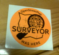
These are intended to be printed on fluorescent orange Avery L7630 clones (63.5mm diameter, 12 to a page) in order to go with the OSM Surveyors Jacket. Extremely cheap to print on a laser printer, but often a bit fiddly to get aligned & printed properly. Paper labels of course not weatherproof, but perhaps that's a good thing. Use responsibly.
Source file: File:Round_sticker_surveyor_64mm_path.svg
Again, the font used is Cabin. If you get that you'll be able to play with the non-text-as-path version to edit the text. Probably only in Inkscape though.


