JA:Front Page Design
OpenStreetMap のフロントページ (別称「The Map」) は長い年月によく堪えてきたといえます。ロンドンのとあるバーで トム・カーデン Tom Carden が2006年頃に下案を作り、それに基づいて CSS や HTML の記述はミケル・マロン Mikel Maron が整えたのです。そろそろ改変のタイミングかもしれません。そこでこのページでは、フロントページを果たして改変する必要があるかどうか意見を集約し、もっとコミュニケーションに役立つようにする、デザイン要素の再配置、あるいは現状維持など、まとめる場所とします。自由に書き換えてください。
留意点として、サイトのあちこちでその他の UI のマイナーな調整が求められています (そもそも編集用ソフトウェアの UI 導入前からの話です。)
フロントページの再設計は必要かどうか
必要なら、何を変えるべきか?
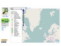
- Better usability. Much much much better usability. Simple as that. Numerous small changes would help a lot - would make the website more inclusive, more friendly, more welcoming. Most importantly - without anything being lost. Making a site more usable for a wider user base doesn't necessarily make it less useful for a technical/enthusiast user base. Nothing is gained by confusing users - and an awful lot is lost. 'Help' should lead to help for all users, not just technical help - or a link to technical help should say 'technical help' or 'mapping help'. 'Documentation' is actually where newcomers find (the very unwelcoming and technical) help they need (if they are very persistent and determined) - the link to the wiki should say something welcoming - like 'help' for example! 'Map key' needs to actually work (nothing displays if the map has defaulted to an alternative to the Mapnik display). As it is, I regard the front page as the place I need to persuade new users to avoid lest they be put off coming back (I know lots of people who have been). Please can us useability experts / ergonomists (etc) find a way to get together on this - a group approach might make people take notice - please include me in this. Rostranimin (talk) 17:00, 31 January 2013 (UTC)
- I agree, usability is quite poor. As an example the "Where am I?" returns information about the current point in map but if I click with my mouse no information about the point is returned. I would have expected a highlight of the clicked point and information about it. The same hapens when a right click takes place, that could be used to highlight the clicked point and offer actions like route calculation to that point. User:Antoniovazquezblanco, May 2016.
Often mentioned: Even on 1024*768 full screen you have to scroll down to enter a search term. On smaller screen/window sizes you won't even see the search box. - Ulfl 09:08, 3 March 2009 (UTC)But as the search box effectively doesn't work I am reluctant to make it any more prominent until we can expect that it can handle the current load, never mind the extra load that more prominence will bring. TomH 10:18, 3 March 2009 (UTC)
Search is the most important thing - it has to work effectively. --Markus 12:59, 3 March 2009 (UTC)
- ... Finally done after more tan two years ... --Stephan75 20:45, 23 May 2011 (BST)
- The export / permalink features should merge, and include the ability to add a marker TomChance 09:40, 3 March 2009 (UTC)
- I think we should avoid mixing up a redesign of what we have with adding enhancements like the ability to include a marker when exporting - we can do that at any time either in the current layout or a new one. TomH 10:20, 3 March 2009 (UTC)
- Fair point, but worth keeping future features in mind to make sure the design can clearly accommodate them TomChance 12:27, 3 March 2009 (UTC)
- I think we should avoid mixing up a redesign of what we have with adding enhancements like the ability to include a marker when exporting - we can do that at any time either in the current layout or a new one. TomH 10:20, 3 March 2009 (UTC)
- sending a link with marker (or track!) is very important for users. --Markus 12:59, 3 March 2009 (UTC)
- “link” could display a permanent link and HTML as it does with Google Maps and Multimap. This would be a familiar interface for many.—Sward 21:45, 3 March 2009 (UTC)
- “Export” could be taken from the main view, and simply an advanced interface accessed via a more simple “link” interface. I have had people ask me how they can download map images even with the link in the main view right in front of their eyes, so this isn’t necessarily a good idea. If link and export are merged, wording such as “share” sounds a little more intuitive, something I might immediately gravitate to if I wanted to do either.—Sward 21:53, 3 March 2009 (UTC)
- “link” could display a permanent link and HTML as it does with Google Maps and Multimap. This would be a familiar interface for many.—Sward 21:45, 3 March 2009 (UTC)
- Quick links to download the current view of the map in various formats on the main map view, avoiding the need to go through the export interface, would be nice. Similar to how Trac’s wiki lists the other formats that can be downloaded at the bottom of each page (more than just “plain text” if you add plugins for other formats).—Sward 22:00, 3 March 2009 (UTC)
- As with some of the mockups, the three tabs to do with the map (view, edit, export) should be grouped and much more prominent. TomChance 09:40, 3 March 2009 (UTC)
- +1 --Markus 12:59, 3 March 2009 (UTC)
- Generally UI elements need to be grouped more logically, the mockups below are a step in the right direction but they still put items together that are unrelated. Here's a quick attempt at grouping:
- View map / edit map / export map (major functions)
- Search / change style / show map key / share current view (map view functions)
- Shop, blog, news, wiki, about, diaries (miscellania to do with the project & community)
- login / register (my account)
- GPS traces (to go under the edit map tab, see other comment) TomChance 09:58, 3 March 2009 (UTC)
- Vertical space is at a premium, but I do think it's worth using some to get the search bar out of the side bar to the top(ish). Full screen button for the map would be good too. Chillly 11:34, 3 March 2009 (UTC)
- Most of the focus on a redesign are how the map is displayed. There's should be more the wider project as a whole. At present we have two link to "Blog" and "Help/Wiki". We should have
- Space for news / donation drive
- Space showing featured image / mapper / application
- Events
- Links to wiki, blogs, resources, community.
現状のページの良い点は何?
- The map is really big and prominent! TomChance 09:41, 3 March 2009 (UTC)
- The design is very similar to wikipedia, instantly conveying the idea that the map is editable wiki-style. This is important familiarity for any visitors who get the idea of wikipedia. Particularly important is having 'view' and 'edit' side-by-side as the first tabs, but also page layout and colour choices in general. -- Harry Wood
- Big map, Wikipedia-layout (familiary recognition value): Tabs, and maybe left bar. --Markus 12:59, 3 March 2009 (UTC)
- Most non-map stuff is located to the left, which fits well in widescreen. Putting more things above the map would make the map quite narrow. --Erik Lundin 12:53, 8 March 2009 (UTC)
改善すべき点は?
- The OpenLayers UI elements could be more prominent, as in mockups 1-3. TomChance 09:43, 3 March 2009 (UTC)
- More plain language! Words like 'permalink' are understood by bloggers and techies, but Google and Multimap both just use "link" with a little symbol, and CloudMade have "share", which will be understood by bloggers and the rest of the population. TomChance 09:51, 3 March 2009 (UTC)
- +1 --Markus 12:59, 3 March 2009 (UTC)
- Multilingual support --PerroVerd 13:04, 3 March 2009 (UTC)
- OpenStreetBugs integration --Steffenvogel 13:24, 3 March 2009 (UTC)
- Simple & clean version for mobile devices --Steffenvogel 13:24, 3 March 2009 (UTC)
- Use the Zoom zoom zoom map library instead of openlayers, just because the zoom is cooler. Ivansanchez 13:59, 3 March 2009 (UTC)
- The tabs "GPS Traces" and "User Diaries" don't make sense as tabs because they are not alternative views of the map. I'd be inclined to have "Normal", "Cycle", "Edit" as tabs, then some other navigation interface for "Search results", "Map Key", "Export", "View Data" which controls the sidebar. It should probably default to the search layout with the text "OpenStreetMap is a free editable map..." where the results would be. --Rjmunro 00:04, 5 March 2009 (UTC)
- When you open www.osm.org the cursor shall be located in the search input field.
- Less links - If you try to navigate without a mouse, you need over 20 tabs to reach "permalink".
- Accessibility! Use Bobby conform webdesign. --Lulu-Ann 20:00, 14 March 2010 (UTC)
このページに配置するデザイン要素とは?
- Language Selector! Avila.gas 18:02, 10 March 2011 (UTC)
- view map
- search (guaranteed prominent at first sight on the upper left!)
- scale
- coordinates <ctrl-c>
- measurement tool
- set marker (with textbox)
- build a track by hand
- import a track
- map key (possibility to turn on/off)
- set route end marker i.e. a second marker. After this is set, a menu should appear where the user can choose a routing engine and / or routing options. Open source routing engines may not be production quality and / or may not support the complete planet, but that may change in the future and we don't want to change the user interface when that happens.
- export map
- link the map with marker/track
- I think this belongs in 'view map', you wouldn't think of sharing a link as exporting and it needs to be more prominent. TomChance 13:47, 3 March 2009 (UTC)
- Agreed, it should be in the main place for browsing the map, and easily identifiable. I also go with changing “permalink” wording to “permanent link”, “link”, or “share”.—Sward 21:42, 3 March 2009 (UTC)
- I think this belongs in 'view map', you wouldn't think of sharing a link as exporting and it needs to be more prominent. TomChance 13:47, 3 March 2009 (UTC)
- send by mail (URL or PNG)
- export as different formats
- contribute to map
- bug reports
- edit with Potlatch
- link to editing wiki page (JOSM, Merkaator, techniques, etc.)
- Community
- Changed from "wiki", just takes user straight to wiki front page to see news, events, etc. etc. TomChance 13:47, 3 March 2009 (UTC)
- what is OSM
- help
- getting involved
- language
- login
レイアウト案/色彩計画は?
- Wikipedia-layout, OSM colours. --Markus 12:59, 3 March 2009 (UTC)
- Accessible for the color blind. --Lulu-Ann 20:01, 14 March 2010 (UTC)
- Try this bookmarklet on openstreetmap.org: javascript:var%20s=document.createElement('script');s.type='text/javascript';document.body.appendChild(s);s.src='http://dl.dropbox.com/u/12923490/Forums/rebuild.js';void(0); --Hind 13:40, 12 April 2011 (BST)
SEO サーチエンジンの最適化
The other thing we can improve is OSMs search ranking (Search Engine Optimisation). If you search Google etc for "openstreetmap" you have no problem... but there are other words or phrases we could optimise the front page for like "free maps" or "make map".
現状と異なる検索用語を最適化するかどうか
We need to get https://gazetteer.openstreetmap.org/ working as an interconnected list of nodes with maps surrounding each one. That way people will find OSM when searching for things on the map, not just searching for "a map". --Rjmunro 14:02, 5 March 2009 (UTC)
実施するなら用語は?
- "free maps"
Steve 03:34, 3 March 2009 (UTC)Do map/maps plurals work the same when doing SEO?
- "free map"
- "make maps"
- "make map"
- "build map"
- "edit map"
Higgy 18:36, 8 March 2009 (UTC) Google Trends should help answer this. As 'free map' and 'free maps' are most popular by a long way it's best optimising for these. Get the terms into meta tags (title, description, keywords), a couple of paragraphs of text, h1, h2, etc.
設計案
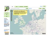
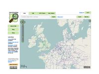
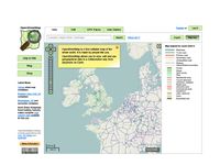
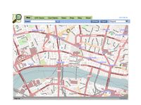
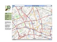
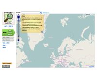
User:Steve asked CloudMade designers to have a quick hack around with the front page to see what it might look like. If we build a consensus then we can put a design brief to them and get something really nice out of it. Feel free to comment on what's good/bad about these hacks:
Green buttons
All at the top
Olive buttons
Side arrow buttons
Fat top bar
More recent design with accompanying blog post (and comments)
Big style selector
Design from User:LastGrape with live mock-up and accompanying blog post (and comments)

Embossed framed
Ben's redesign as explained on the forum, including a different logo.

Portal Page
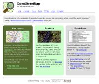
Portal design similar to russian and german designs and the original osm3col. - No map! Overview of OSM for newcomers. Map is one click away
コメント
'Thin top bar' is the best. It's a nice and clean design with a lot of space for our map. However it needs a link to the wiki, the layer selector should stay where it is currently (to keep the Openlayers look&feel). It should be investigated if it looks good to move the items in the bottom bar to the top bar to free even more space for the map or as an alternative display information about the item under the cursor in the bottom bar (this might put a big load on the server and should carefully considered). Perhaps the edit button should instead be a Tab next to "Map" to keep it wikipedia-like. "GPS Traces" could be hidden somewhere. --R2D2 12:02, 3 March 2009 (UTC)
- +1 --Steffenvogel 13:26, 3 March 2009 (UTC)
The closeable yellow box with intro text is an interesting idea, because it would solve one of the most pressing problems, that the sidebar uses too much vertical space (You only see this problem when not logged-in). Obviously it should not appear when logged in, and also when passing parameters for showing a particular map. Trouble is, despite these measures, I imagine it might end up being annoying for regular vistors / OSMers. -- Harry Wood 12:03, 20 March 2009 (UTC)
- I share Harry's concern, but think the problem can be solved if the box only pops up when you visit the page without any path after the host name and it remain closed (by setting a cookie) the first time the user closes it. Then you'd only have to see it once per computer/browser and you could still send location URLs to people without annoying them. -- Einarr 13:09, 29 July 2009 (UTC)
My favorite, personally, is the first row, it's not a drastic change, but it adds some nice color, and it keeps the Wikipedia layout. It was mentioned you wanted "Wikipedia-layout, OSM colours" -- Adrian L C (new developer)
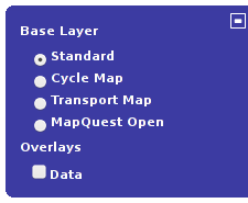
マップのレイヤーの試案
|
top-left: most transparent controls, all white, black popout |
I've created several mockups of another GUI layout for the map layer specifically (not so much the remainder of the site), I don't want to hijack the page so I'll post it below; If there's a set that's liked, I'll be happy to slice and export it as early as within the week. The only major programmatic changes that would be required are moving around the buttons to compensate for the overlap they would have (imagemap?) the the possible addition of the "joystick" ball in the middle of the buttons, which might be used for freescrolling (a la 'Bing' maps) -- Ken Vermette (also new, HELLO EVERYONE!! :D ) 11 August 2010
- Hi Ken. Welcome! It's a good idea to focus on one particular element, because I think we may end up making iterative improvements to the front page design, rather than any big bang redesigns (possibly), and so design ideas like this could be considered separately. There are other more radical ideas for showing different layers on the page more prominently. Maybe one step at a time is a good idea.
- The existing layer and zoom controls are implemented as part of OpenLayers, so I guess the suggestion of a freescrolling joystick control would be one to put to the OpenLayers developers (a separate but overlapping developmer community)
- For something we can easily drop in to the osm front page what we'd actually need is an OpenLayers 'theme' I guess. At the moment we use the default OpenLayers theme with dark blue controls. Another nice one is this black theme from mapbox.com. Beyond the minor flower arranging considerations here, I particularly like their re-design of the '+' symbol. I think it shows the layers idea better. As a really minor step, we could adopt that but in blue.
- -- Harry Wood 19:10, 5 November 2010 (UTC)
Some real changes were actually made. A couple of months back we made this transition:
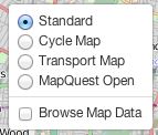
...and the data layer is currently accessible off the edit tab drop-down instead
-- Harry Wood 14:16, 6 August 2012 (BST)
- Updated again since. We're now using leaflet not OpenLayers, so we use the leaflet version of the layer picker. Also the tickbox for 'browse map data' is back over where it was before -- Harry Wood 23:10, 24 January 2013 (UTC)
アクセシビリティ
I have written a guide for blind users to download OSM XML Exports for use with LoroDux navigation from the Front Page using a screen reader. There is a problem to access the frame with the search result with the most common Screenreader JAWS. I am in contact with a JAWS developer and hope I can soon report how to fix the page so that it becomes fully accessible. If you have any questions, contact me. --Lulu-Ann 14:17, 10 June 2011 (BST)
