Tshirt competition
Please submit your designs to this competition. If people like your design then perhaps we can put it on Tshirts and other OSM Merchandise
Gallery
Matt's Entry
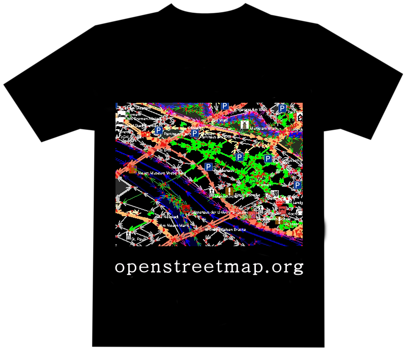
The idea would be to have the logo on the front and some text like "OpenStreetMap.org" on the back... Maybe with "Surveyor" or something.
- I would like to see this with the 0's and 1's projected on the map, so that the numbers follows the outline of the map. --Imi 06:44, 26 Apr 2006 (UTC)
- Like this? --Matt 20:58, 27 Apr 2006 (UTC)
- I like this one. I don't like the ones with "coffee stains" below. Avoid brown. What if the zeros where solid white and the ones were black? --LA2 05:32, 1 May 2006 (UTC)
- I thought about having the 0's and 1's projected on the map, so they are skewed to follow the borders ;-).. I mean - you use a magnifier on a map and see, that it is composed out of 0's and 1's, right? So the numbers should be on the plane of the map, not on the plane of the magnifier. (I consider this a bug of the original osm logo too.. :-D ) --Imi 08:35, 28 Apr 2006 (UTC)
This one has more colours, so its
- More interesting,
- More expensive to print.
Maybe it could have some funny message on the back, like: "I'm an open map surveyor. If you see me running, I'm probably trying to calibrate my GPS."
Another variant for an "Isle of Wight 2006" special.
Richard's entry
I guess the traced lines could do with looking a bit more like a road network (and probably lat/long rather than OSGB ;) ). And maybe we could have a bit of spot colour with a yellow GPS on the handlebars. But you get the general idea.
Tim_w's entry
I've been thinking about OSM from the point of view of a user - people adding their own streets where they live. Their own way. It also refers to Openness - it's not some corporations way of doing stuff, and the freedom that comes with tagging. It also plays with making "Ways" in OSM.
I also love the Tim Berners Lee quote. Just the words "Grassroots remapping" on their own would be a great t-shirt.
- http://chippy2005.googlepages.com/osmteeWordsBack.png/osmteeWordsBack-full.jpg
- http://chippy2005.googlepages.com/osmteeLogobreast.png/osmteeLogobreast-full.jpg
- http://chippy2005.googlepages.com/osmteeLogoFront.png/osmteeLogoFront-full.jpg
- http://chippy2005.googlepages.com/osmteeLogo.png/osmteeLogo-full.jpg
- Not bad at all, but could you perhaps make it say "openstreetmap.org" instead of just "openstreetmap"? --LA2 20:25, 10 Aug 2006 (BST)
Farzaneh's entry
It was the maintanance weekend and the services were down, so I sat down and implemented a T-shirt idea that came to Fran and I during a mapping trip to different cities in Iran.
Lammersch's entry
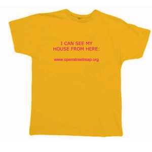
I thought: let's take the personal approach...
- Simple, appealing statement. Maybe just needs replacing "house" with "street" as OSM is not about mapping individual buildings, but streets. And a logo. --Stefanb 10:25, 20 July 2007 (BST)
ThomasKlosa's entry
I understand OSM as a project where people contribute content from an individual area.
Why not creating individual T-Shirts.
During the order procedure, the user can select an area of the current map that is printed to his shirt along with eg. 1 line of text entered by the ordering person as well.
OpenStreetMap.org + logo shall be printed on the back.
Michael's entry
riccard0's entry
ulfl's entry
- Variations (click to enlarge)
Licensed under CC-BY-SA-2.0, SVG versions are available here. Might need a better map excerpt - Ulfl 00:05, 15 February 2008 (UTC)
blk's entry
Shirt created for the OpenExpo 2008, Bern, Switzerland
PM me for SVG version as i can't upload it (the Garmin is also a vector-element)
 --blk 21:12, 9 March 2008 (UTC)
Grenzdebil's entry
This started as the backside, I'm still working on the front... but I think it can also be used as a front side. Headline "SURVEYOR" can be excanged for anything (it's all SVG), I started with this one because Imi suggested it here. Contact me if you want the SVG. (will upload it when front & back are done)
I really like it. In my case, it would be use rather to make people understand what you do (is this man crazy going all the streets of the city?!) rather than publicity for itself. However, things like "I map my world. DISCOVER how" is a good one for that. I'd very like to have the SVG please. --Freebourg 12:53, 26 June 2009 (UTC)
 Grenzdebil 18:12, 29 March 2008 (UTC)
Otaznik's entry
Just logos and few lines of text. But i like it simple. SVG: Osm t-shirt by otaznik2.svg (Firefox isn't able to hide cutted part of data under magnifying glass =/)
t_u_b_o's entry
everybody could use their favourite snippet


Miskellaneous's entry
Improvements? Verbesserungsvorschläge?
This shirt is great! If it is possible please post your original Blender and Gimp files because I would love to wear this shirt when presenting and promoting OpenStreetMap project. User:ValentTurkovic
My concept: In germany the cardinal directions "Nord", "Ost", "Süd", "West" are abbreviated to "N", "O", "S", "W".
On a compass the "N" is often replaced by an arrow, so you've left "O", "S" and "W", the "W" can be seen as a flipped "M", ...
 or
or 
but it looks much better when the "W" is replaced by "M"
My implementation: I've modeled a compass in Blender v2.46
and after applying GIMP's "edge-detection" filter I've got this first draft:
The cool thing is that the arrow points to the web address ;-)
klausewitz's entry
do something for your environment, save the planet!
--klausewitz 23:06, 27 December 2010 (UTC)


