Map Icons/WikiProject Pictograms
This is a project to research, create and improve pictograms for use in rendering on maps, mostly to represent points of interest.
The initial spur for this project was some informal chatting between a few people at the State Of The Map 2007, about the different symbols available for the Osmarender maps, largely inspired by some of the great talks on cartography.
Some initial work might involve:
- Compiling a list of all the pictograms which have already been uploaded to the wiki (both the SVG sources and PNG renderings)
- Brainstorming lists of the types of points of interest which you might want to put on a map, and ranking them in order of importance/usefulness somehow.
- Thinking of different ways to represent those points of interest.
- Coming up with some general guidelines for pictogram design.
- Doing some initial sketches.
Guidelines
Two types of pictogram need
General-purpose maps
An initial observation, when looking at pictograms (and points of interest) on maps, is that there seem to be two types of 'need'. Some pictograms representing points of interest are useful on general-purpose maps, as a way of helping to give you some information about the lay of the land and the geography of an area. For example, a graveyard marked on a map might be useful, even if you have no intention of visiting it, because it might be a useful landmark for wayfinding and tells you that the patch of ground its on isn't something else like a park or green which you are interested in visiting.
Specific-purpose map
By contrast, there seems to be a second set of points of interest, and related pictograms, which are only usefully marked on a map if you are specifically looking for them. They might still make sense on a general map, but would be more useful on a specific-purpose map. An example might be a letterbox pictogram, which only really helps you if you're looking for the nearest place to post a letter, and might otherwise get in the way.
Of course, some pictograms fall between camps (and some arguably aren't all that useful at all), but this observation seems to hold as a general guideline.
Why is this distinction relevant? Well, because the former type of pictogram needs to be able to be placed on a map more sympathetically to the general base cartographic features, whereas the latter type perhaps need to stand out a bit more. Another reason is that for the purposes of this project, we might want to concentrate our efforts on the former type of pictogram rather than the latter.
Copyright concerns
Please respect copyrights - especially the set of sport icons designed by Otl Aicher is copyrighted and cannot be used here.
Design guidelines
When designing pictograms, a good method is to make a quick sketch of the object first. Draw it small on a piece of paper, this will help you figure out what the most basic form of the object is. Using a church as an example, you would likely draw a triangle (the steeple) on top of a rectangle (the main hall). When you are ready to digitalize your pictogram, use the grid to keep your drawing neat, this will help it maintain the look of other OpenStreetMap pictograms.
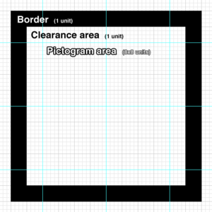
It's proposed to use a standard grid (right) for this project. The main area is divided up into 10 units by 10 units. The outer 1 unit is designated a 'clearance' area, and you shouldn't normally venture into this area (however you can go slightly over the line if you need to). There's also an outer optional 1 unit border (which wouldn't normally appear on a map, but might appear on a sign or key).
Within the grid, each unit is sub-divided into 4 sub-units. For further granularity, you can sub-divide into 8 units instead (or even 16), but 4 is usually as far as you need to go.
Some initial studies
A look at the 'church' icon (see place of worship map feature), to see how it might fit within the grid, and how it might be improved...
Existing pictogram:
Putting this into the grid.
Hmm, the top bits looks a bit thick (1 unit wide). Let's trying making them half the size:
Better, but still not perfect. Let's try starting a new pictogram from scratch, one that more closely resembles the 'typical' church (judging from a Google image search anyway).
Not bad eh? Maybe the proportions aren't quite right yet, but it's a good start. Should the corners be rounded, I wonder? Hmm, maybe that's a bigger decision.
Excellent examples of currently used pictograms
 Parking (mapnik) Parking (mapnik)
|
Proposed pictograms
Symbols which are used on OSM Carto
See OpenStreetMap_Carto/Symbols
List of pictograms
Pictograms for general-purpose maps:
| Name | Pictogram (ideas) | Rationale/usefulness |
|---|---|---|
| Ambassy | Administration | Common public amenity |
| Church | 
|
|
| Airplane | 
|
|
| Golf | 
|
Useful as a wayfinding marker, and to make clear that an apparent green space on a map isn't publicly accessible. |
| Castle | 
|
Popular tourist attraction. Gives a sense of an area. |
| Sports Centre | selection of common sports equipment | Useful amenity, commonly used. |
| Pub | Pint glass beer pump handle |
Common social point. Especially useful on maps of rural areas (lunch stops) |
| Post Office | Envelope | Common amenity found in rural areas (although decreasingly so). Useful for a wide range of services, and makes a good wayfinding marker. |
| School | Blackboard children (with satchel) |
Common. Helps give a sense of an area. |
| Library | Stack of books | Common public amenity. |
| Police Station | Siren police badge |
|
| Fire station | Fire truck Fire hose Fireman's pole? Fireman's Hat |
Wayfinding marker. |
| Theatre | Drama masks curtains stage jester? |
Helps gives a sense of an area. Useful for tourists. |
| Cinema | Projector film reel screen popcorn? |
Common entertainment venue. |
| Prison | Person behind bars | Useful waymarker. Helps give a sense of an area. |
| Town Hall | Classic architectural frontage | Useful waymarker. |
| Camp Site |  ridge-pole tent igloo tent |
Useful for backpackers/tourists (who use maps a lot) |
| Theme Park | rollercoaster | Common tourist attraction. Gives a sense of an area. Identifies a large area of land use. |
| Museum | Building front with columns | Popular attraction. |
| Underwear shop | 
|
Common type of shops. |
See also
- WikiProject Pictograms/Working List
- Map Icons
- Inkscape Open Symbols offers open source SVG symbol sets that can be used as Inkscape symbols and will soon offer cleaned up versions of the SJJB SVG Map Icons, see https://github.com/Xaviju/inkscape-open-symbols/issues/39


